We build pages that move.
Fahm Studio designs and builds one landing page at a time, from the first sentence to the live link.
Fahm Studio is a portfolio concept, not a registered company. The four pages in the cube are real and live, built by Ziad-AlHusseiny.
Confidence is knowing what to leave out.
Most landing pages try to impress on every line. We pick the one effect a page can carry and build that one thing until it holds up on a phone, with a keyboard and with motion turned off.
A headline that breaks its grid, a gallery that is an actual object, a cursor that answers to you: one of them, done properly. The rest of the page stays quiet on purpose.
4 pages in the cube. 0 stock photos in any of them.
Four pages. One cube.
Each face is a real, live page from this portfolio, with a number it measured on launch day.
Scroll to turn the cube, or pick a page from the list.
Swipe the cube, or use the buttons under it.
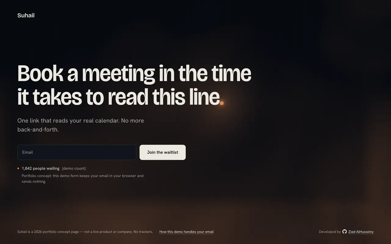 01 Suhail A waitlist for a scheduling app, on one screen. The full stop of the headline is a star. Lighthouse 100 on a phone. 101 KB to load. How it was built
 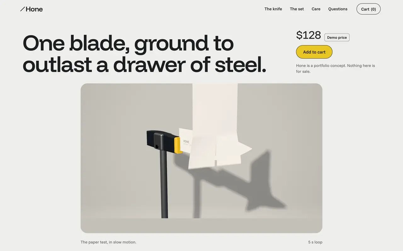 02 Hone A ceramic chef’s knife. A rendered paper test grows from a card to the full screen as you scroll. Lighthouse 100 on a phone. 364 KB with the video. How it was built
 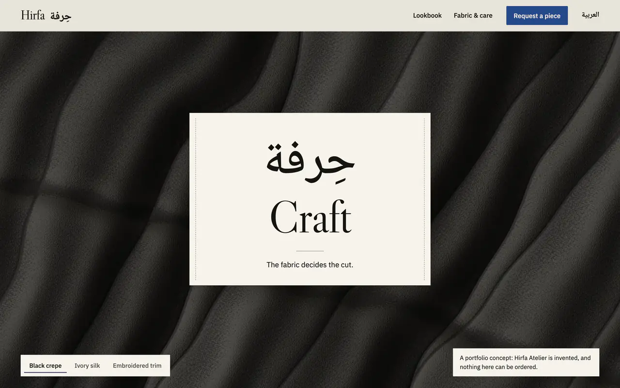 03 Hirfa Atelier A modest-wear atelier in English and Arabic. The headline holds on a woven label while the fabric changes. Lighthouse 98 on a phone. 5.6 KB of script. How it was built
 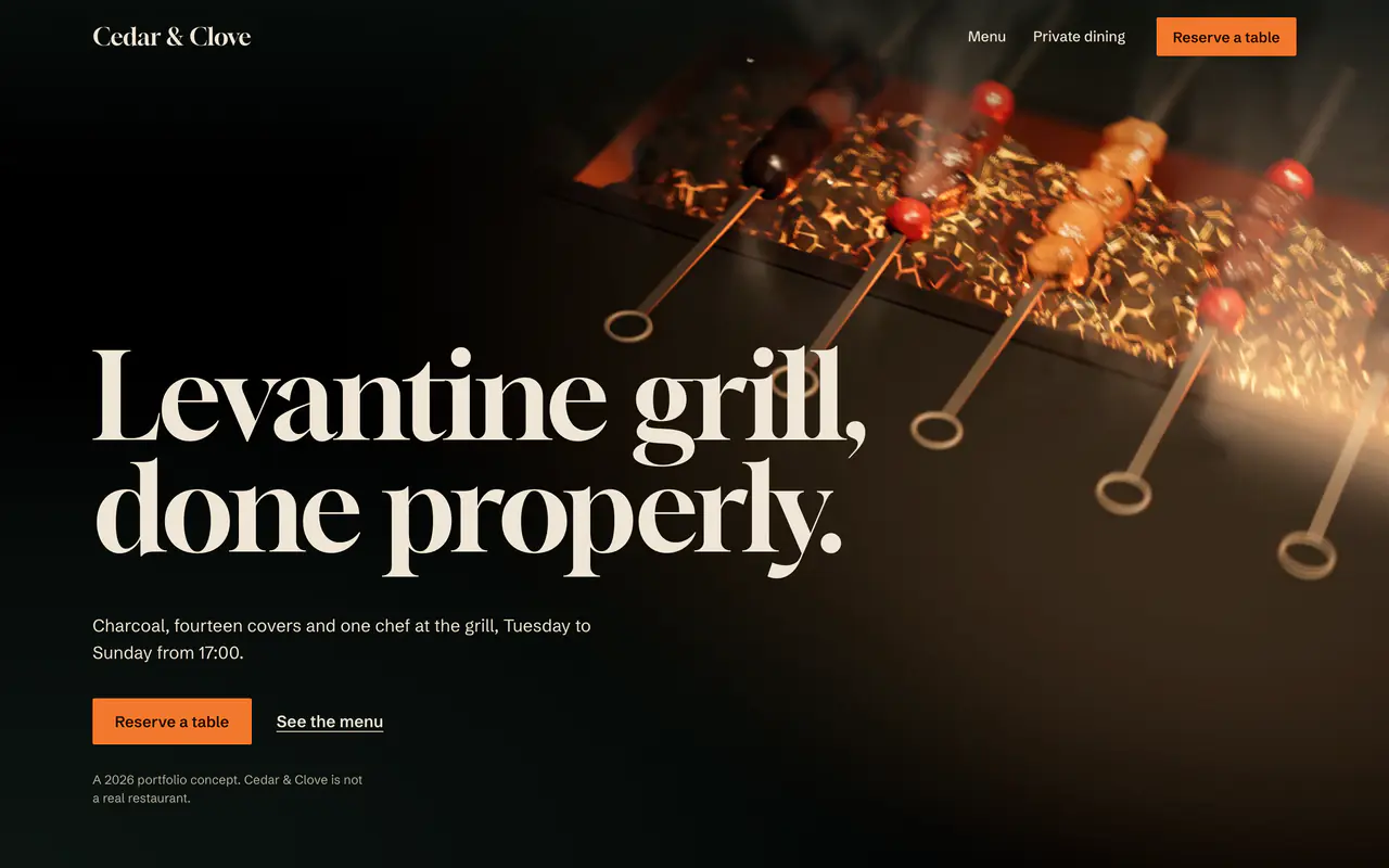 04 Cedar & Clove A halal Levantine grill. Charcoal at night, and a menu that sets each dish down where you point. Lighthouse 100 on a phone, in all three runs. How it was built
 1 of 4: Suhail
Numbers from each page’s verification file, measured on its live link between 6 and 8 October 2026.
Four services. No package tiers.
Positioning
One sentence that says what you do and who it is for, tested on three people who have never heard of you.
Design
A small system of four to six colours and two typefaces, decided before any layout.
Motion
One signature interaction per page, built to work on a phone, with a keyboard and with motion turned off.
Build
A static site that scores 90 or more on mobile Lighthouse the day it ships, hosted on a free tier.
Four checkpoints, one deploy.
01Brief
We read your brief line by line and write down everything that is missing, wrong or out of date before any design starts. Hone’s brief gave steel the wrong hardness; it was caught here.
02Design
Three different directions for the first screen, then the whole page at desktop and phone width, approved before a line of code. Every page in the cube was designed this way first.
03Build
Section by section, with a screenshot at 1440 and 375 pixels wide after each one, and every motion written together with its reduced-motion version.
04Ship and verify
Three browsers, a keyboard pass, contrast measured on real pixels and Lighthouse three times on the live link. Hirfa Atelier shipped after 888 checks.
Measured on launch day.
Lighthouse on a phone, run three times on each live link, what the first screen loads on a phone, and console errors in Chromium, Firefox and WebKit.
| Page | Performance | Accessibility | First screen on a phone | Console errors |
|---|---|---|---|---|
| Suhail | 100 | 100 | 101KB | 0 |
| Hone | 100 | 100 | 364KB | 0 |
| Hirfa Atelier | 98 | 100 | 263KB | 0 |
| Cedar & Clove | 100 | 100 | 515KB | 0 |
Performance is the median of three runs. Hone and Cedar & Clove load a short video on their first screen.
Let’s build something.
Tell us what is broken about the page you have now. We’ll tell you what it costs to fix, in writing, before you commit to anything.
This is a portfolio concept. The form writes the email for you to read and sends nothing.